


Returning once again to the same plot from the Winston & Strawn survey report, but shifting from criticism, we should praise several aspects of the original plot.
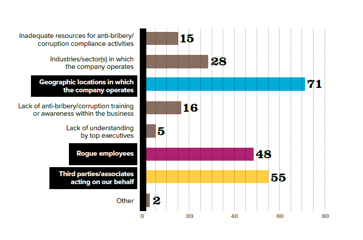
The somewhat-narrow width of the bars makes a more appealing impression than when bars are thick and therefore tightly packed shoulder to shoulder. Compare the version below where thick bars put more ink on the plot, but offer no more insights or clarity.
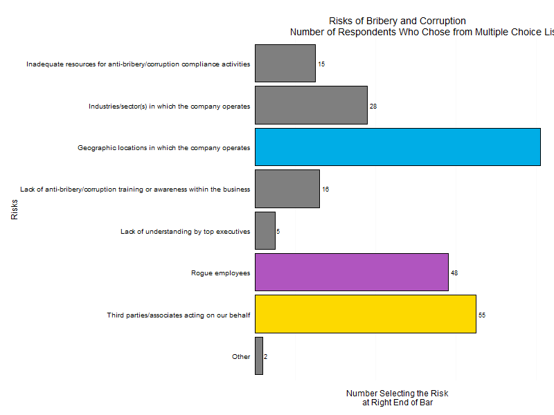
Similarly, the spacing between the bars helps a reader take in the message of the plot, and better than very narrow lines. The version above takes away that spacing although it adds around each box a frame colored black to clarify individual bars. This is not an improvement!
Third, the labels for each risk element are clearly written and spelled out on the left, vertical axis. An alternative choice could have been placing the text above the bars. The plot below shows labels on top of the bars.

Fourth the plot takes up most of the page and has been placed squarely in the middle of it and therefore becomes the obvious focus of attention.