Articles Posted in Graphics

Published on:

From Wikipedia we learn that a choropleth is a “thematic map in which areas are shaded or patterned in proportion to the measurement of the statistical variable being displayed on the map, such as population density or per-capita income.” The Economist, July 5, 2014 at 23, shows a choropleth of the comparative regulatory burdens the states impose on small enterprises.

Each state is colored from 1 to 12 according to letter grades. 1, the lightest color corresponds to an A+, slightly darker corresponds to A, and so on. Immediately you can see that California, Illinois and Maine were graded F, with the darkest coloring, as they were judged to throw up the most obstacles to a small business. By contrast Texas, Utah, and Idaho get A+s and the lightest color for imposing the least burdens.

We will show some choropleths later on this blog. They are an excellent tool to show geographic differences in some value. This particular one suggested to me that lawyers for small businesses stay busiest where the regulatory hand lies heaviest. Someone could test that hypothesis by looking at lawyers per million state residents and comparing that ratio to the regulatory grades of the states.

Published on:

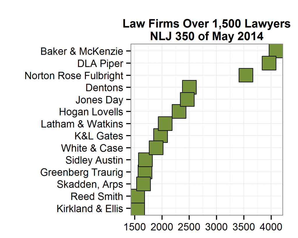
When you create a plot, you may be content with the default text labels on the axes. You should, however, at least be aware of some choices you could make. To make this point real, let’s plot the 14 law firms that this year’s NLJ 350 reported as having more than 1,500 lawyers.

june19fifteen100axes
Pay attention to the horizontal axis (the X-axis) above. The default for the software I use has 500-lawyer intervals and adds as “text” the numbers of lawyers without commas.

Most people find it easier to process larger numbers if there are commas. Some parts of the world use a dot (period) instead of a comma and software can accommodate that style. The next plot adds commas.

Published on:

When they create a graphical plot, most people unthinkingly use the default axis linest. The axis lines on the typical scatter-plot or bar plot are the rectangle of lines around the plot data – the points or columns. Outside the axis lines are the tick marks, labels, text, and legends. Most people think of the horizontal X-axis on the bottom of the plot and the vertical Y-axis on the left, but there are also the top and right-side axis lines.

Using data from the General Counsel Metrics 2010 benchmark survey, the four plots below show different styles of X and Y axis lines. The first is plain vanilla: a black line around the data plotting area. The plot below it chooses a dashed line that is thicker than the default line size. The third plot introduces color, blue, while the final plot removes the left and bottom axis lines (X and Y).

My preference leans toward minimalism. Shun colored, thick, dashed and like options for axis lines because they distract the reader from the actual data being presented. Default black lines are comfortable to readers, but I still favor no lines at all.

Published on:

Some scatterplots have so many data points close to each other that you can’t distinguish much from the cloudy mass where they cluster. That problem is known to data scientists as over-plotting. An example would be a plot that shows for a large law department the amounts of incoming invoices clustered by month, where each invoice is represented by a separate point. For invoices of a common amount range, such as $3,000 to $5,000, there would be lots of them each month, and the plot would blur them together.

One technique to deal with such unintelligible blobs of points is to plot the same data on two, three or more plots. Each one has the same axes but displays the data of law firms of a certain size or matter type. Doing that, readers of the plot will be much more likely able to discern individual points. Some data visualizers refer to sets of comparable plots as “panels” or “small groups.”

A second graphing technique uses hexbins, six-sided polygons that are shaded to indicate the density of points in a certain area. You lose precision with hexbins, but if there were that many points in an area, you would not have been able to pick out individual points anyway. The color gradient of the shadings, however, readily conveys relative density – darker colors, for example, tell us that many more invoices of that type arrived than lighter-colored hexbins.

Published on:

A Palo Alto startup, Ayasdi, builds software that uses the branch of mathematics known as topology. Topology concerns how shapes interact with space, and has application to portraying large collections of data.

As described in Bloomberg BusinessWeek, January 28, 2013 at 34, Avasdi’s software can take huge amounts of data and help users find patterns in it. Users can upload their information to the company’s data centers which then applies its algorithms to look for relationships and interconnections. Those findings appear as colorful 3-D pictures on screen and users can ask questions about that data and manipulate it.

Topological computations and graphics sound like complements to other classification and clustering tools available to data analysts. Specifically, benchmark surveys amass many variables and hundreds participating companies. Software of the kind offered by Ayasdi may in future allow those who manage in law departments to visualize better and learn more about such accumulations of metrics.


Published on:

A network graph, when the term is used by mathematicians, means a structure comprised of nodes and edges.  For example, a law department could represent the law firms it retained during the previous year by means of such a graph.  The department would be the central node on the graph and each law firm would be at the end of an edge.

The visual depiction would be more informative if the edges were of different thicknesses to indicate the amount paid the law firm during the year.  Likewise, the length of the edge could be proportional to the number of matters handled by the law firm.

If the data from a law department were represented this way, you could also show the size of the law firms by the area of their node shape (a circle).  One further use of this graph would be to color or shape the node of each law firm according to some other factor, such as the number of timekeepers used by the firm or the number of areas of law serviced.