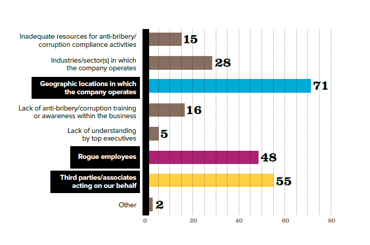
Let’s take a look at a plot from a survey conducted by DigitalWarRoom, its “2015 Ediscovery IQ Meter.” On page 12 of the report, which was published in July 2105, there is a plot that looks quite similar to the plot below. (The reproduction does not have tiny tick marks on the horizontal axis placed at the ends of the axis and between the vertical bars nor does it match the green color gradient of the bars.) Nevertheless, we can draw from it a few lessons in graphical presentation.

First, if you label for bars with values, such as the four percentages on top of the four bars, you don’t gain anything from horizontal grid lines. In truth, you clutter the plot. Even odder, the vertical y-axis has no values so the reader can’t even calibrate lines to values!
Second, although the plot above does not show how the original has each bar with the same gradient of darker green at the bottom gradually changing hue to a lighter gree