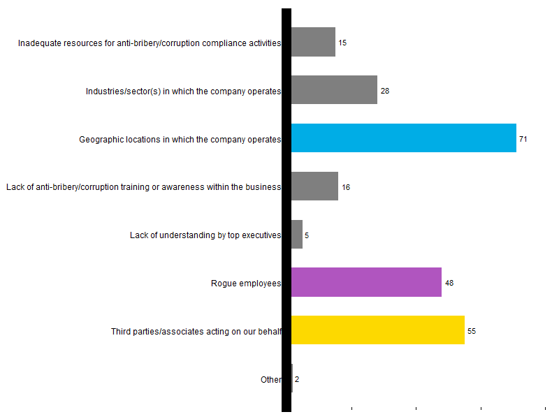
We return to the same survey plot and our topic of effective visualization of survey results. To see the previous post that explains the source data and the purpose of this series, click here. The version shown below incorporates the changes recommended previously regarding redundant data and serves as the starting point for the improvements discussed here. Let’s focus on the typography.

A font comes from a font family, such as the familiar Helvetica, Courier or Times Roman. The face of a font could be normal, italic, bold, upper case, or other formats. Third, with any family and face, the size of a letter, number or symbol can be small, medium, large or some specified size. There are other ways to characterize type (such as kerning and left or right alignment), but we will limit ourselves here to the three of family, face and size. We will use the term “typeset” to summarize font, face, and size.
The font on the left-hand, y-axis labels is different from the font on the x axis along the bottom, and both of those fonts differ from the bulky numbers at the ends of the columns. Additionally, on the original plot, but not shown here, there are black rectangles around three of the labels, which also have white coloring instead of black, so we could say that there are four different typesets employed in this one plot.
Compounding the multiplicity of fonts and colors, the typeset comes in at least three sizes.
Sometimes the designer of a plot deliberately interjects a different font/family/size, such as for emphasis, or to bring to the reader’s attention something important. But none of the four variations on the original plot convey any special meaning (although the numbers at the ends of the bars give the gist of the plot and might therefore justify the bold face).
To show how one might improve the plot by unifying the typeset, the plot below renders each of the text elements in Helvetica, 12 point, plain, black. Unless there is an informational reason to change fonts, stick with the same set.