


In this series of blog posts, we will use a survey by the U.S. law firm Winston & Strawn to learn about survey methodology. In 2013 the firm produced a 33-page report based on the survey results entitled “The Winston & Strawn International Business Risk Survey 2013”. To download a PDF of the report, click here.
The plot in the image below comes from page 18 of the report. The survey had asked respondents the question stated in the header, given them eight choices, and this plot presents the results as a graph. Here we will focus on one aspect of that plot: how effectively it presents the sum of the number of times respondents selected each of the risk choices.
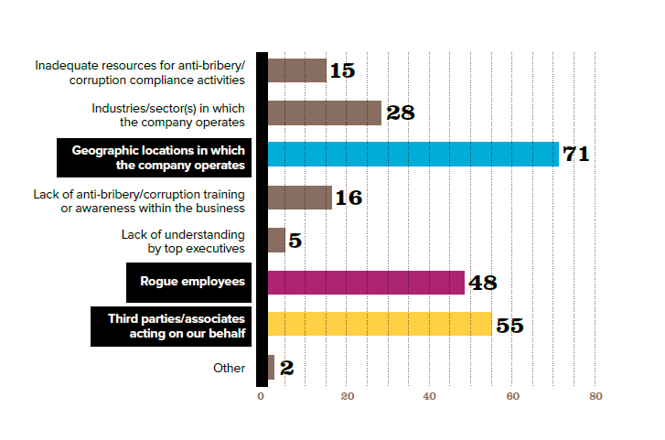
Notice that the plot identifies the number of companies selecting a risk by three methods. One is the horizontal x-axis that ranges from zero on the left to 80 on the right. For example, “Rogue employees” is just to the left of the 50 marker on the x-axis so a reader could estimate 47-49 respondents chose if from that bar’s end point, where it reaches on the x-axis, and the figure from the y-axis.
The second method is the numeric label at the end of each bar. “Rogue employees” proclaims a large “48”.
Third, from the bottom axis light, vertical dotted lines extend upward from each interval. These vertical “grid lines” as they are referred to by data visualizers, are spaced at even intervals of five. If there were a label that explained the intervals someone could count nine of them from the left plus a little bit and estimate that 47-49 respondents chose “Rogue Employees”.
The plot would be less cluttered, less redundant, and more precise if it omitted the superfluous grid lines as well as the unnecessary x-axis. It would leave the numeric labels as the salient, immediately understandable statements of the results.
The plot below recreates the original plot using the R programming language. The reproduction does not exactly copy every feature of the original plot. For example, the multi-line spacing of the left axis labels do not conform, nor do the width and spacing of the bars or the type fonts or the black boxes of the left axis labels. That said, the revised plot has improved the chart components discussed above: the redundant representation of the numeric totals.
