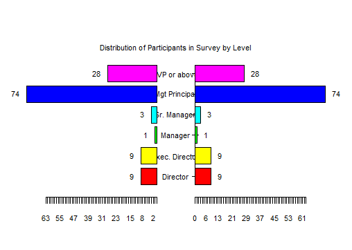
When you survey your clients to assess how satisfied they are with your law department, you want confidence that you have tapped a representative group by their levels. One way to visualize the responses you get from your survey by a distribution of levels is shown below. For this example, six ranks of clients are stacked from the lowest at the bottom, “Directors,” to the highest-level at the top, the “EVPs or above”.
Twenty-eight of the respondents were at the highest level of the company, followed by 74 Mgt Principals.
Yes, we could present the same information in a table (with the titles abbreviated):
Dir. Exec. Dir. Manager Sr. Mgr Mgt Princ. EVP+
9 9 1 3 74 28
but a table lacks the visual dimension of length to convey relative numbers. A graph can provide that cue.
Our preference is a colorful graphic along the lines of the one shown below. The “arms” extending out from each level are the same length here, but you could, for example, show domestic and international on either side of the divide in the middle.