


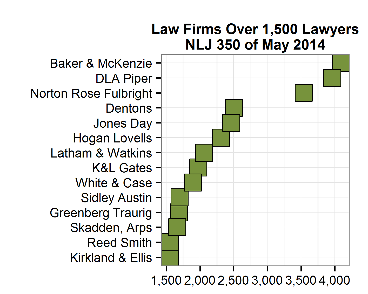
When you create a plot, you may be content with the default text labels on the axes. You should, however, at least be aware of some choices you could make. To make this point real, let’s plot the 14 law firms that this year’s NLJ 350 reported as having more than 1,500 lawyers.

Pay attention to the horizontal axis (the X-axis) above. The default for the software I use has 500-lawyer intervals and adds as “text” the numbers of lawyers without commas.
Most people find it easier to process larger numbers if there are commas. Some parts of the world use a dot (period) instead of a comma and software can accommodate that style. The next plot adds commas.
The final plot decreases the intervals to 250 so that it is easier for the reader to know how many lawyers each firm has. To adjust for the crowding that would happen if that larger set of interval numbers were arrayed on the X-axis, this plot angles the numbers 30 degrees.
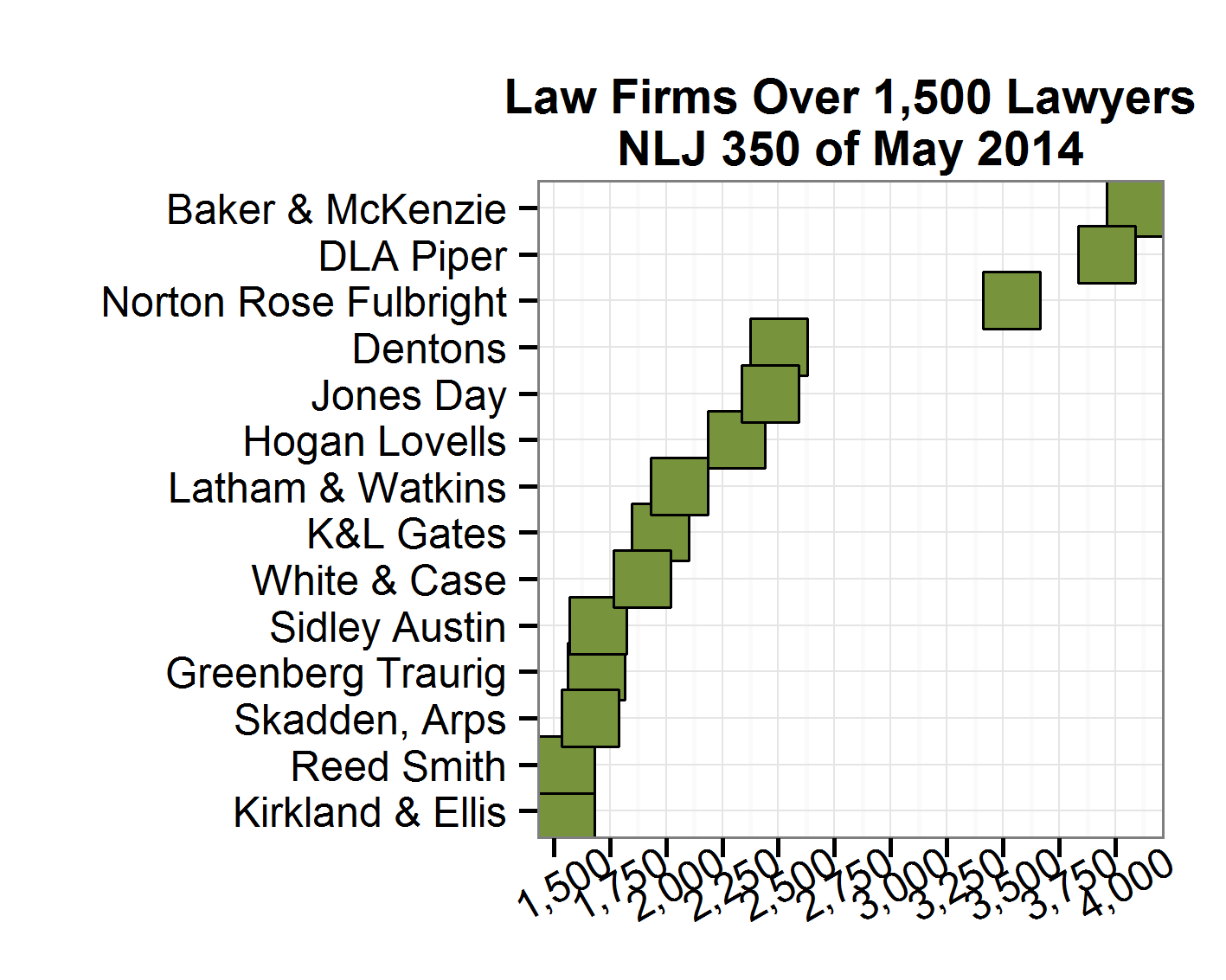
Whatever you can do to make it easier for your plot readers to grasp your data and its significance you should give thought to. How you label the text on each axis illustrates this point.