Articles Posted in Graphics

Published on:

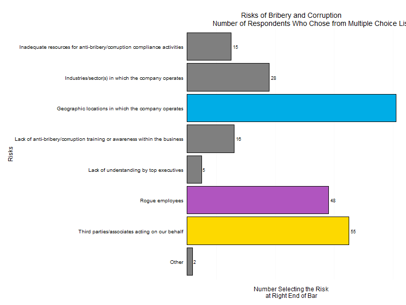
The graphical visualization skills of the New York Times leave me envious. For that reason, a plot in the sports section on August 12, 2015 regarding aces by male tennis players caught my eye. Not having the data available to the Times, I sort-of re-created the plot below. In the same style, mine shows how many law departments participated in the GC Metrics benchmarking survey, sponsored by Major, Lindsey & Africa, during its first five years.

8-14-15 NY Times
The three salient features of the plot that are discussed below are (1) the location of the axis labels, (2) the case used for them, and (3) the absence of a title.

The axis label for the vertical, y-axis perches on top of that axis and reads left-to-right instead of in the usual location in the middle and rotated 90 degrees. It is easier to read left to right, to be sure, but it takes a moment to locate a label far from the customary place. The axis label for the horizontal axis lurks on the far left, instead of in the middle of the plot. Perhaps this placement has advantages, perhaps not.

Published on:

Let’s take a look at a plot from a survey conducted by DigitalWarRoom, its “2015 Ediscovery IQ Meter.” On page 12 of the report, which was published in July 2105, there is a plot that looks quite similar to the plot below. (The reproduction does not have tiny tick marks on the horizontal axis placed at the ends of the axis and between the vertical bars nor does it match the green color gradient of the bars.) Nevertheless, we can draw from it a few lessons in graphical presentation.

Rplot01 Digital green
First, if you label for bars with values, such as the four percentages on top of the four bars, you don’t gain anything from horizontal grid lines. In truth, you clutter the plot. Even odder, the vertical y-axis has no values so the reader can’t even calibrate lines to values!

Second, although the plot above does not show how the original has each bar with the same gradient of darker green at the bottom gradually changing hue to a lighter gree

Published on:

We can take one more look at the seminal Winston & Strawn plot, now streamlined and improved as discussed previously. A few graphical design choices deserve comment. We emphasize, however, that graphical design choices are many, which means the permutations and combinations of them are even more numerous. Experience (and some research on how humans perceive and interpret graphs) suggest quite a few well-accepted guidelines, such as simplicity and clarity, but graphical visualization remains in the subjective domain of what feels appropriate to the designer. We could analogize to writing style.

A convention in plotting is that the so-called factors run along the x-axis at bottom and the quantitative values run up the y-axis on the left. With such long axis labels, however, that choice has no appeal here. If we shorten the labels and rotate them, it is possible, as seen in the plot below.

Another choice would have eschewed bars in favor of points.

Published on:

Returning once again to the same plot from the Winston & Strawn survey report, but shifting from criticism, we should praise several aspects of the original plot.

Screenshot (6)_snip Winston pg19
The somewhat-narrow width of the bars makes a more appealing impression than when bars are thick and therefore tightly packed shoulder to shoulder. Compare the version below where thick bars put more ink on the plot, but offer no more insights or clarity.

Rplot08nojunk
Similarly, the spacing between the bars helps a reader take in the message of the plot, and better than very narrow lines. The version above takes away that spacing although it adds around each box a frame colored black to clarify individual bars. This is not an improvement!

Published on:

We revisit the same Winston & Strawn plot which appears as the plot as it was in the most recent post in its improved re-incarnation. Now, let’s take up four more observations.

The thick black line on the vertical y-axis adds nothing: It is an example of what is referred to as “chart junk”, an element of a plot that adds no useful information but clutters up the plot and makes it that much harder to grasp.

Second, neither axis has a label to explain what the axis represents. Labels are generally a good thing so that a plot can stand on its own without explanations in the report text.

Published on:

Another aspect of the plot that has been discussed previously [Click here for the latest post in this series] should be called out.

Whoever prepared the plot chose to color differently each bar of the three risks most often selected. The blue bar represents “geographic locations in which the company operates”, a sort-of red bar represents another risk, and the third with yellow. In addition to those color distinctions, the plot also embeds the labels of those three risks in black boxes with white font. Shown below is the plot as it originally appeared.

Screenshot (6)_snip Winston pg19Neither of these graphical techniques add value to the plot or, indeed, make sense. They make readers work more to figure them out. Are the choices of colors significant, as in red-yellow-green means something? Is there a linkage between the coloring and the boxing? What do either or both tell us that the length of the bar and the label at the end don’t?

Published on:

We return to the same survey plot and our topic of effective visualization of survey results. To see the previous post that explains the source data and the purpose of this series, click here. The version shown below incorporates the changes recommended previously regarding redundant data and serves as the starting point for the improvements discussed here. Let’s focus on the typography.

Winstonpg19noredundantdata2
A font comes from a font family, such as the familiar Helvetica, Courier or Times Roman. The face of a font could be normal, italic, bold, upper case, or other formats. Third, with any family and face, the size of a letter, number or symbol can be small, medium, large or some specified size. There are other ways to characterize type (such as kerning and left or right alignment), but we will limit ourselves here to the three of family, face and size. We will use the term “typeset” to summarize font, face, and size.

The font on the left-hand, y-axis labels is different from the font on the x axis along the bottom, and both of those fonts differ from the bulky numbers at the ends of the columns. Additionally, on the original plot, but not shown here, there are black rectangles around three of the labels, which also have white coloring instead of black, so we could say that there are four different typesets employed in this one plot.

Published on:

In this series of blog posts, we will use a survey by the U.S. law firm Winston & Strawn to learn about survey methodology. In 2013 the firm produced a 33-page report based on the survey results entitled “The Winston & Strawn International Business Risk Survey 2013”.  To download a PDF of the report, click here.

The plot in the image below comes from page 18 of the report. The survey had asked respondents the question stated in the header, given them eight choices, and this plot presents the results as a graph. Here we will focus on one aspect of that plot: how effectively it presents the sum of the number of times respondents selected each of the risk choices.

Screenshot (6)_snip Winston pg19
Notice that the plot identifies the number of companies selecting a risk by three methods. One is the horizontal x-axis that ranges from zero on the left to 80 on the right. For example, “Rogue employees” is just to the left of the 50 marker on the x-axis so a reader could estimate 47-49 respondents chose if from that bar’s end point, where it reaches on the x-axis, and the figure from the y-axis.

Published on:

A Shepard’s diagram typically describes the composition of soil in terms of three materials: clay, silt, and sand. The pyramid labels each portion according to the respective proportions of those materials in a particular clump of soil. Naturally, seeing such a diagram led me to think about law departments.

My notion was that a company has three basic sources of legal guidance: its internal law department (if there is one), the law firms or private lawyers it hires, and the clients, consultants, outsource services and others who help identify, prevent, or deal with legal issues. In the diagram I call that third group, collectively, “resources”.

So, here is the Shepard’s diagram of the three legal services. Each side ranges from a low percentage of reliance on that service to a high percentage. So, for example, the top component represents a company where the law department does everything, there are no outside counsel, and the “resources” are mid-way. I tried to label the components that result in a short way, but realize that the labels can be improved.

Published on:

As explained before, a choropleth map colors geographic regions according to some variable. The choropleth map below shows the United States and the regions are some of its states. Those states are colored on a gradient by a variable: the number of graduates from highly-ranked law schools in the state who serve as the general counsel of a Fortune 500 company.

F500 GCs and states of top 50 law schools


Many states are missing because they have no law school in them that has a US News & World Report ranking better than 50 (the best-ranked school has a 1 ranking). I took that subset of the full 150 law firms that have rankings simply to make the creation of this plot easier.

The gradient color code ranges from very light blue for those states with the fewest graduates from its law schools (Alabama had one, for example) up to bright red for Massachusetts, which mostly because of Harvard Law School can boast the most Fortune 500 general counsel who graduated from its law schools (50).