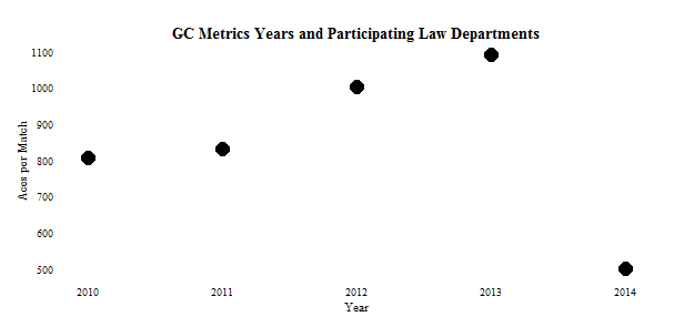
The graphical visualization skills of the New York Times leave me envious. For that reason, a plot in the sports section on August 12, 2015 regarding aces by male tennis players caught my eye. Not having the data available to the Times, I sort-of re-created the plot below. In the same style, mine shows how many law departments participated in the GC Metrics benchmarking survey, sponsored by Major, Lindsey & Africa, during its first five years.

The three salient features of the plot that are discussed below are (1) the location of the axis labels, (2) the case used for them, and (3) the absence of a title.
The axis label for the vertical, y-axis perches on top of that axis and reads left-to-right instead of in the usual location in the middle and rotated 90 degrees. It is easier to read left to right, to be sure, but it takes a moment to locate a label far from the customary place. The axis label for the horizontal axis lurks on the far left, instead of in the middle of the plot. Perhaps this placement has advantages, perhaps not.
Generally speaking, WHEN YOU WRITE IN ALL CAPITAL LETTERS it comes across as shouting (“flaming” in the online world). Even odder to me is that the names of the tennis players next to each point are not in all caps, so the discrepancy is even more jarring.
As to the final feature, the lack of a title to the plot might be excused by the surrounding presence of the article. The article talks about career aces (a serve in tennis that the opponent served to does not even hit – a bit like a swing and a miss by a batter in baseball) by notable tennis players and their number of aces per match. Career aces are on the bottom axis; aces per match are on the vertical axis, and both axis are labeled. Even so, plots should convey self-contained stories, which means putting in a brief summary for a title.
To make clear the differences between the Times plot and the three elements discussed above about it, the plot below incorporates the changes. Note: I like the placement of the labels, I would lower-case them, and I would add a title.