Articles Posted in Metrics Methodology

Published on:

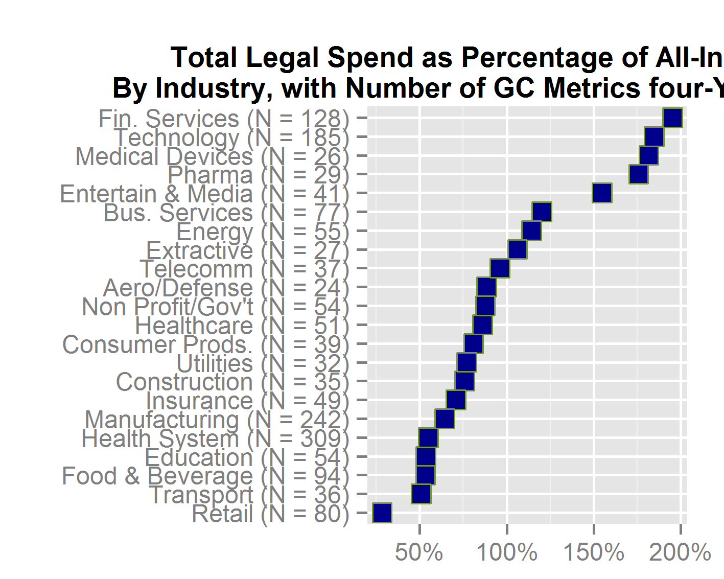
A precept of reproducible research, such as survey results that allow readers to understand the methodology and credibility of the findings, is to make generous use of “N = some number”. That conventional shorthand for “how many are we talking about” shows up in almost every reproducible-research graphic. Whether in the title of a plot, the text that relates to it, on the plot itself or in a footnote, a reader should always be quickly able to learn how many respondents answered each question or how many documents were reviewed or how many law departments had a given benchmark, or whatever pertains to the topic of the plot.


The larger the N, the more reliable the averages or medians that result from the data. For example, if the “average base compensation of general counsel” rose 2% from one year to the next, it makes a huge difference whether that change applies to N = 8 [general counsel] or N = 80.  Changes in small numbers of observations have much less credibility than changes in large numbers.

Published on:

If you want to plot cities on a map, for example to show locations of law schools on a map of the United States, you need to have the longitude and latitude of each school’s city.

The brute force way to get those geographic intersections of longitude and latitude, which I call “coordinates”, is to search one at a time on a web site that provides them when you enter the city’s name. This takes a long time if you have hundreds of cities.

A second way to do it is to find some compilation of coordinates and extract the ones you need and merge that information with the appropriate law school. This, too can be a long process prone to errors.

Published on:

Continuing the analysis of Fortune 500 chief legal officers, let’s test a hypothesis: the better the law school, the more of its graduates lead one of these illustrious legal departments. To have data regarding which schools are better, I incorporated the rankings of about 150 law schools in 2013 by US News & World Report.

The plot below has a point for each law school that had more than one general counsel of a Fortune 500 company, as reported by American Lawyer Media. Note that it does not have complete data because ALM did not report the law school of about 50 of the GCs. Finally, if US News did not rank a law school, that school is not on this plot. The plot sorts the schools from the best ranking on the left to the highest ranking on the right.

F500 GCs and LS Ranking       The high-flying point on the left is Harvard Law School, which was ranked in a tie for second and has 42 graduates serving as a Fortune 500 GC. Yale Law School, ranked number one, has 8 such graduates.

Published on:

Sometimes you want to compare companies on metrics that vary widely. As an example, patent applications granted during a year for a group of companies may vary from five to fifty. The external legal spend of those same companies may vary from $750,000 to $6 million. You can rank each company from high to low on patents and then on spend and find that company A is number 5 on patents and number 8 on spending. Thus, company A is somewhat “better” on patents than spending because it was higher on the ranking.

But ranking eliminates most of the data that could more finely discriminate the companies from each other. That company A ranked number 1 on patents merely says it is two positions ahead of company C ranked number 3. You’ve lost the actual difference between them. In fact, perhaps company A had three times as many patent applications granted than company C. Being fixed intervals, ranks lose information.

A method to preserve the granularity of data is to calculate how each company’s figure varies from the average figure for the group. Company A then might be 500% of the average while company C might be 150% (or approximately like that). At least that listing gives some idea of the size of the gaps between companies.

Published on:

In full-page ads, Bottomline Technologies proclaims that “Bottomline is chosen 3X more than any other legal spend management vendor.” Being inquisitive about law department metrics, I visited the web page the ad says lets you “Find out why” – www.bottomline.com/3x.

Don’t get your hopes up. The page suggests that more than 180 companies with claims functions have licensed software from Bottomline. It then gives “the top 3 reasons why they chose Bottomline.” Ok, maybe those are the reasons why they chose the company’s software. But that does not explain why companies choosing among software offerings similar to Bottomline’s for legal spend management select Bottomline three times more frequently than they select the competition. Or perhaps I misread the quoted statement in the first sentence.

A quick Google search turned up nothing about the ad’s statement. My crude understanding of advertising law is that if you assert something about your product or service, someone can challenge you to back up that assertion. “WonderProduct cleans three times faster” trumpeted in an advertisement creates a legal obligation on the part of the manufacturer to have sufficient factual support. Even if the preceding two sentences don’t capture the nuances of our laws and regulations, it still seems to me that Bottomline should explain the basis for its 3X claim

Published on:

After preparing the Four-Year Report, which starts with data on 3,846 law departments, for this blog post we took a look at one particular metric: total legal spend as a percentage of revenue (TLS). To keep the companies in this mini-analysis somewhat more comparable, we narrowed that group to US participants.

The chart below took the median TLS of each industry and divided it by the average TLS for all the companies. With that calculation, you can see which industries had medians that significantly exceeded the average (Financial Services and Technology) along with those that fell significantly below (Retail and Transport). Industries near 100% on the bottom axis were right about average in TLS (e.g., Telecomm and Extractive). As could have been predicted, a highly regulated industry tops the chart, followed by several that have large patent investments. But this correlation does not hold throughout.

The number in parenthesis after the industry names tells how many companies are covered.june172014indratio


Published on:

A calculation called “entropy” can tell us how concentrated the companies are in an industry. Concentration means how large the share is of revenue for the largest company in the industry, that company and the next larges, the two largest and the third, and so on. Specifically, entropy is measured through information described by the shape of the probability distribution of market shares. A higher entropy index describes a large number of participants and represents a lower concentration and consequently higher competition in the industry.

It would be my hypothesis that law departments in lower entropy industries – those dominated by a few companies – would enjoy better benchmarks than law departments in higher entropy industries – those with many companies and no dominant entity.

According to the Journal of Management In Engineering, Jan. 2005 at 19, several alternative indices of entropy gauge industry concentration, including “ogive, national average, portfolio, McLaughlin, and information theory”. However, the article argues, the entropy measure is superior to other measurements in that “entropy can be decomposed into additive elements which define the contribution of diversification at each level of product aggregation to the total”. Accordingly, entropy has frequently been used to measure the degree of industrial concentration and thus competition within an industry.

Published on:

Some benchmark surveys ask for spending data in U.S. dollars and leave it to the participants to convert their non-dollar spending however they choose to do so.  Other surveys, including GC Metrics, accepts data in whatever currency the participant uses and then has to decide on a conversion rate.

What I have done is taken the approximate average of the currency against the U.S. dollar for the calendar year involved.  By approximate I mean that I eyeball the exchange rate for the year and pick a figure that seems as representative as possible.  There are undoubtedly more precise ways to convert currencies, but they would be much more computationally intensive and harder to explain to those who receive the report.

*******************

Published on:

The hardest data to extract from a law department is data that requires someone senior to do anything.  Try getting the general counsel to evaluate 25 law firms.  The next hardest data to obtain is that which someone collects for one purpose, but the data analyst recognizes as a source of secondary insights from that data.  For example, information from a matter management system can tell something about how well a law department has permeated and served the various client groups in a company.


Still, a third strata of data lurks within reach of law department managers and data analysts.  These pools of data are not consciously collected, but they could tell quite a bit.  One example would be the number of emails sent to and from each outside life firm as a proxy for or a supplement to the amounts paid them.


I explore in my article published by the National Law Journal on March 13, 2013.what I term “hidden data” in law departments.  There are quite a few.  In time, some of them will be tapped and found to be insightful.  Here is the URL for the article: 13-03-11 hidden data in law departments NLJ Rees Morrison

Published on:

You have a report that gives for each industry the median number of litigation cases per law department in the industry.  Let’s say 45 cases.  A later table in the report gives medians for subsets of that total number, such as medians of employment cases (perhaps 12), of patent cases (3), and of all other cases (28).


What you should not do is add up the individual case-type medians (12+3+28 = 43) and expect the sum to be the same as the median number of total litigation cases (45).  The reason is that each median stands on its own and was created on its own.  The software sorts each one high to low and picks the middle value.  It would be merely a coincidence if the sorted list of total number of cases arrived at the same number.


One reason is that if the sorted list has an even number of items, the software averages the middle two – a figure that the other lists, if they have odd integers of items, will never produce.  A second reason is that one or more of the component lists (employment, patent and other in the example) might have some missing data, which would throw off a potential match of medians.