Published on:

If you want to plot cities on a map, for example to show locations of law schools on a map of the United States, you need to have the longitude and latitude of each school’s city.

The brute force way to get those geographic intersections of longitude and latitude, which I call “coordinates”, is to search one at a time on a web site that provides them when you enter the city’s name. This takes a long time if you have hundreds of cities.

A second way to do it is to find some compilation of coordinates and extract the ones you need and merge that information with the appropriate law school. This, too can be a long process prone to errors.

Published on:

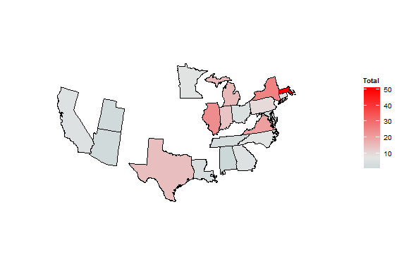
As explained before, a choropleth map colors geographic regions according to some variable. The choropleth map below shows the United States and the regions are some of its states. Those states are colored on a gradient by a variable: the number of graduates from highly-ranked law schools in the state who serve as the general counsel of a Fortune 500 company.

F500 GCs and states of top 50 law schools


Many states are missing because they have no law school in them that has a US News & World Report ranking better than 50 (the best-ranked school has a 1 ranking). I took that subset of the full 150 law firms that have rankings simply to make the creation of this plot easier.

The gradient color code ranges from very light blue for those states with the fewest graduates from its law schools (Alabama had one, for example) up to bright red for Massachusetts, which mostly because of Harvard Law School can boast the most Fortune 500 general counsel who graduated from its law schools (50).

Published on:

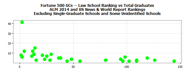
Continuing the analysis of Fortune 500 chief legal officers, let’s test a hypothesis: the better the law school, the more of its graduates lead one of these illustrious legal departments. To have data regarding which schools are better, I incorporated the rankings of about 150 law schools in 2013 by US News & World Report.

The plot below has a point for each law school that had more than one general counsel of a Fortune 500 company, as reported by American Lawyer Media. Note that it does not have complete data because ALM did not report the law school of about 50 of the GCs. Finally, if US News did not rank a law school, that school is not on this plot. The plot sorts the schools from the best ranking on the left to the highest ranking on the right.

F500 GCs and LS Ranking       The high-flying point on the left is Harvard Law School, which was ranked in a tie for second and has 42 graduates serving as a Fortune 500 GC. Yale Law School, ranked number one, has 8 such graduates.

Published on:

ALM publishes data about the Fortune 500 companies and their chief legal officers. One of the pieces of information is the law school from which the CLO graduated. Firing up my trusty software for data analysis, I looked at the distribution of those graduates.

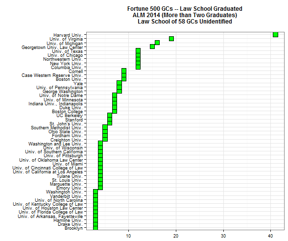
The plot below shows how many of that select group of general counsel graduated from each law school where the school had at least two graduates. Thus, the eight schools at the bottom left claim three graduates each. Sixty-eight law schools (out of a total of 117 different schools) had a single graduate or two graduates. I left them out because the graph becomes much harder to read with so many schools on the left axis. By the way, at least two of them are not U.S. law schools!

F500 GCs law schools


Having sorted the schools by increasing numbers of GC-graduates, it is clear that primus inter pares, by far, is Harvard Law School. Virginia (19), Michigan (16), and Georgetown (15) trail by quite a bit.

Posted in:
Published on:
Updated:
Published on:

A column in Bloomberg BusinessWeek, July 2014 at 10, argues against House Republicans’ efforts to prevent the Department of Education from collecting and publishing data on college costs. Without good information on such matters as all-in costs of attending a school or graduation rates, prospective students will be left mostly in the dark.

The column brought to mind that when governments require data to be submitted and make it available to the public, the data is much more reliable, comprehensive, and timely than data collected by other means. Voluntary efforts lead to low compliance and selection bias; efforts by publishers or players in a market can never reach a government agency’s level of certitude; and privately collected data is, well, private. If you want data collected over time so that you can tease out trends, the problems of non-governmental data are magnified.

To my knowledge, no Federal or state government agency obtains and makes public any information about either corporate legal departments or private law firms. There is data about the legal industry sector and labor numbers (employees, gross revenue, possibly numbers of firms) but nothing else. Particularly, data is lacking about individual law firms. You can painfully extract some data from sources such as EDGAR filings or patent applications, but the collecting agencies are not focused on metrics regarding legal industry participants.

Published on:

One hugely important lesson branded into me from analyzing data is the importance of step-by-step procedures. This may sound elementary, but when you start with an Excel file of data from a client, it is crucially important to keep an audit trail of each step of your transformations and calculations.

If you change the names of columns so that they are consistent with code you have already written, you should record and store each change. If you add another variable [think of a variable as a column in Excel], you need to track how you made that addition. Do likewise for any calculations, such as calculating and storing external spending per lawyer. And, by the way, comments along the way complement your efforts to be logical and measured.

Data preparation always involves learning as you go, so if you haven’t saved the steps you have taken, you create nightmares of uncertainty about the quality of your data. Or you can’t figure out how you got (or failed to get) some result later on.

Published on:

Two very common steps for a data analyst are to subset data or to aggregate data. When you write code that subsets data, you instruct the computer to pick out a portion of the data and work with that smaller set. For example if you have data on law firm mergers, you might want to isolate the mergers in a single state or for a particular year. You would subset the larger data collection so that only the particular state or year would be worked on thereafter. Or you might want to isolate the states of a particular region. In all these instances, you would need the work-horse of programming: subset.

The reciprocal function of subsetting is aggregating. Pivot tables in Excel perform aggregation quite easily. In fact, every programming language that does quantitative analysis has the function. Very commonly, a data analyst writes code so that data is combined. Staying with the law-firm merger example, a short program segment – actually, only a line or two of code, would add up all of the lawyers in the acquiring firms of a particular state. The computer will dutifully aggregate that amount.

Many graphical plots present either subsetted data or aggregated data, or both. The two concepts and the program code that carry them out are ubiquitous in data science.

Published on:

I had just written about levels of state regulatory burdens when I read two editorials in the New York Times, July 7, 2014 at A17. One of them describes four ways that GDP calculations mismeasure the size of our economy. For example, the author writes “In its first 20 years, the Clean Air Act generated health savings and other benefits valued at $22 trillion, compared with $500 billion in compliance costs.” He points out that the net gain is not counted in GDP. But my point is that some people will cheer that finding and accept it; others will jeer at it and vehemently reject the methodology as well; almost no one will reconsider their views.

Coincidentally, right next to that editorial, Paul Krugman bemoans the disjunction he perceives in many people between the beliefs they hold and how they process facts: “Confronted with a conflict between evidence and what they want to believe for political and/or religious reasons, many people reject the evidence.” Worse, the better informed they are, the more fervently opponents will toss out the contrary findings.

Those of us who collect and analyze data that reflect law department or law firm management decisions come to realize that the best benchmark data, the most insightful correlations, the clearest graphs stand almost no chance to persuade, or even inform, those who “just know” something different. Incentives work; money matters; technology speeds up; law firms gouge; convergence saves …. All of us, even as we cherish our self-image as being thoughtful, willing to change our minds, and open to different beliefs, are for the most part in ideological straight-jackets.

Published on:

From Wikipedia we learn that a choropleth is a “thematic map in which areas are shaded or patterned in proportion to the measurement of the statistical variable being displayed on the map, such as population density or per-capita income.” The Economist, July 5, 2014 at 23, shows a choropleth of the comparative regulatory burdens the states impose on small enterprises.

Each state is colored from 1 to 12 according to letter grades. 1, the lightest color corresponds to an A+, slightly darker corresponds to A, and so on. Immediately you can see that California, Illinois and Maine were graded F, with the darkest coloring, as they were judged to throw up the most obstacles to a small business. By contrast Texas, Utah, and Idaho get A+s and the lightest color for imposing the least burdens.

We will show some choropleths later on this blog. They are an excellent tool to show geographic differences in some value. This particular one suggested to me that lawyers for small businesses stay busiest where the regulatory hand lies heaviest. Someone could test that hypothesis by looking at lawyers per million state residents and comparing that ratio to the regulatory grades of the states.

Published on:

Another perspective on the law firms that were ranked highest on M&A deals is to look at the average size of the deals they worked on. That data appears in the following plot.

avg.value

The X-axis shows average deal size in billions of US dollars. The plot adds another piece of information: the home country of the firm.  To do so, the software alters both the shape of the “point” and its color for each law firm. An example is the Blake Cassells, the only Canadian firm in the group, and thus the only one in red and with a circle.

At a glance you notice that the two firms in the top right, Cleary Gottlieb and Sullivan & Cromwell, have had a “fewer but bigger” set of clients; by contrast, Jones Day in the lower left appears to churn through many more deals but much smaller ones.