


Another aspect of the plot that has been discussed previously [Click here for the latest post in this series] should be called out.
Whoever prepared the plot chose to color differently each bar of the three risks most often selected. The blue bar represents “geographic locations in which the company operates”, a sort-of red bar represents another risk, and the third with yellow. In addition to those color distinctions, the plot also embeds the labels of those three risks in black boxes with white font. Shown below is the plot as it originally appeared.
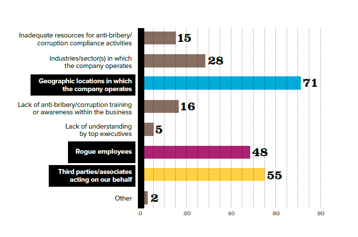 Neither of these graphical techniques add value to the plot or, indeed, make sense. They make readers work more to figure them out. Are the choices of colors significant, as in red-yellow-green means something? Is there a linkage between the coloring and the boxing? What do either or both tell us that the length of the bar and the label at the end don’t?